A select is a form element that provides users with a way to select amongst a set of options.
Usage
When to use
- To allow user to make a selection from a pre-defined set of options in a form.
- When the length of the form is a concern or screen real estate is vital.
When not to use
- When a user can select more than on option, consider using Checkbox.
- When there are fewer than 5 options, consider using Radio instead.
- When need to display a list of buttons or links in a menu, us Dropdown.
Required and optional
Best practices
- For complex forms, indicate required fields. This is the most explicit and transparent method and ensures users don’t have to make assumptions.
- If a field is required, consider adding a default value to help the user avoid and error.
- For shorter, simpler forms (ie. login/signup and feedback requests), indicate optional fields instead.
- If a field is optional, avoid using a default value as that value will get passed as data to the form.
Marking required fields in forms
Validation
Types of validation
Use a combination of client side and server side validation for the best user experience. Catching basic errors with client side validation allows the user to quickly resolve the error before submitting the form.
Client side validation
Client side validation, sometimes also referred to as inline validation, is an initial check that happens in the browser to ensure required fields are filled out and that the value is in the correct format. Learn more about client side validation.
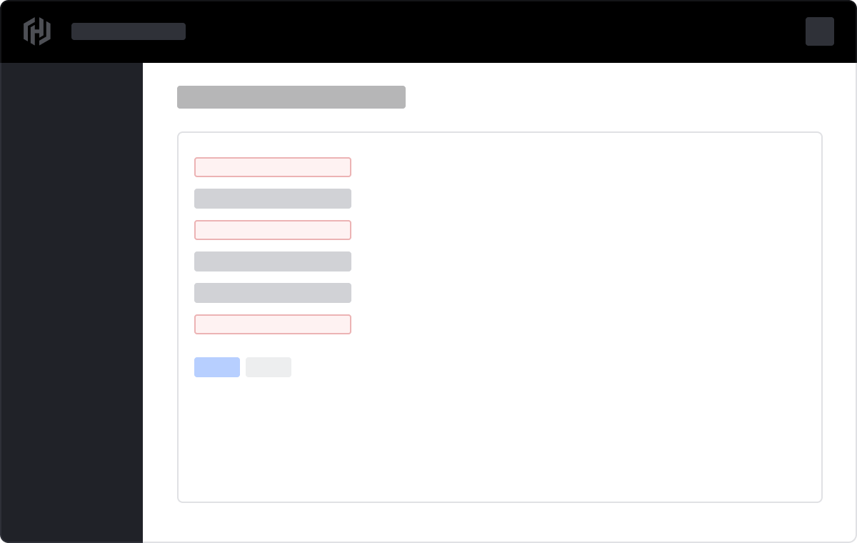
Server side validation
Server side validation provides a more thorough check on the server once the data has been submitted and helps keep our applications safe.
When using server side validation, display an AlertInline in the Critical variant above the form listing all errors with links to each invalid field.
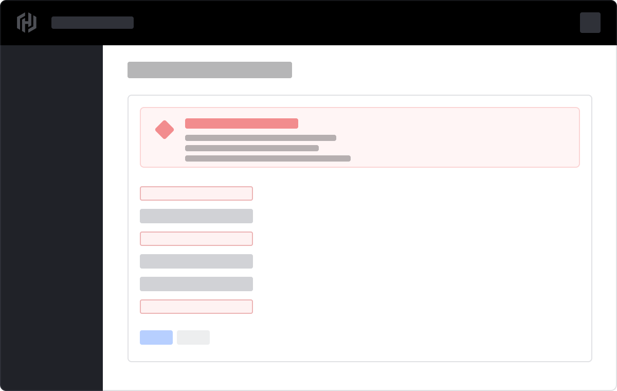
Displaying multiple error messages
We recommend showing all applicable error messages directly under their corresponding form field.
Content
Label
- We recommend keeping labels clear and concise, about 1-3 words. They should not consist of full sentences.
- 3.3.2 Labels or Instructions (A): Labels or instructions are provided when content requires user input.
Options
- We recommend keeping options clear and concise; avoid full sentences.
- Avoid using the same word at the beginning of a set of options.
- Order the set of options in a logical way based on the use case, ie. default or most commonly selected options first, alphabetically, or numerically.
Helper text
- Use helper text when needing to provide the user with extra details about the data you’re asking them to select from.
Error messages
- Error messages need to provide the user with enough context to guide them in resolving the error.
- Keep error messages short and to the point.
- ie. "Network region is required. Select a region."
- Avoid overt politeness; don’t use "please" or "thank you" in your messages.
- 3.3.1 Error Identification (A): If an input error is automatically detected, the item that is in error is identified and the error is described to the user in text.
- 3.3.3 Error Suggestion (AA): If an input error is automatically detected and suggestions for correction are known, then the suggestions are provided to the user, unless it would jeopardize the security or purpose of the content.
- 3.3.4 Error Prevention (Legal, Financial, Data) (AA): For web pages that cause legal commitments or financial transactions for the user to occur, that modify or delete user-controllabel data in data storage systems, or that submit user test reponses, at least one of the following is true: submissions are reversible, data is checked and user is provided an opportunity to correct them, a mechanism is available for reviewing, confirming, and correcting the information before finalizing the submission.
- 4.1.3 Status Messages (AA): In content implemented using markup languages, status messages can be programmatically determined through role or properties such that they can be presented to the user by assistive technologies without receiving focus.
Refer to HashiCorp’s Style, Language, and Voice Guidelines for more content tips.
There are two possible ways to use the Form::Select component: using the "base" variant (essentially just the control itself) or using the "field" variant (the control plus label, helper text and error).
The "field" variant is used most commonly, because it provides, for free and out of the box, accessibility enhancements. The "base" variant can be used if you need to achieve custom layouts or have special use cases not covered by the "field" variant.
Form::Select::Field
Basic use
<Hds::Form::Select::Field as |F|>
  <F.Label>Target infrastructure</F.Label>
  <F.Options>
    <option value="Kubernetes">Kubernetes</option>
    <option value="Other">Other</option>
  </F.Options>
</Hds::Form::Select::Field>
This "field" component creates:
- a
<label>element with aforattribute automatically associated with the selectIDattribute - a
<select>control with an automatically generatedIDattribute, and theOptionselements yielded as children.
Selected option
You can pre-select one of the options passing to it the native selected attribute:
<Hds::Form::Select::Field as |F|>
  <F.Label>Target infrastructure</F.Label>
  <F.Options>
    <option value="Kubernetes">Kubernetes</option>
    <option value="Other" selected>Other</option>
  </F.Options>
</Hds::Form::Select::Field>
Grouped options
Since the Options container yields the content to the <select> element, it’s possible to use the <optgroup> tag within it, to group similar sets of options:
<Hds::Form::Select::Field as |F|>
  <F.Label>Target infrastructure</F.Label>
  <F.Options>
    <optgroup label="Most common">
      <option value="Kubernetes">Kubernetes</option>
      <option value="AWS">AWS</option>
    </optgroup>
    <optgroup label="Others">
      <option value="CloudWise" selected>CloudWise</option>
      <option value="SWA">SWA</option>
      <option value="Other">Other</option>
    </optgroup>
  </F.Options>
</Hds::Form::Select::Field>
Helper text
You can add extra information to the field using an "helper" text:
<Hds::Form::Select::Field @value="036140285924" as |F|>
  <F.Label>Target infrastructure</F.Label>
  <F.HelperText>The target infrastructure is where you want to deploy your apps.</F.HelperText>
  <F.Options>
    <option value="Kubernetes">Kubernetes</option>
    <option value="Other">Other</option>
  </F.Options>
</Hds::Form::Select::Field>
When the "helper" text is added, the component automatically adds an aria-describedby attribute to the select control, associating it with the automatically generated ID of the helper text element.
Extra content in label and helper text
The Label and HelperText contextual components used in the "field" yield their content; you can pass not just plain text, but also structured content.
For example:
<Hds::Form::Select::Field as |F|>
  <F.Label>Target infrastructure <Hds::Badge @size="small" @text="Beta" /></F.Label>
  <F.HelperText>This is an experimental feature (<Hds::Link::Inline @href="#">read more</Hds::Link::Inline>).</F.HelperText>
  <F.Options>
    <option value="Kubernetes">Kubernetes</option>
    <option value="Other">Other</option>
  </F.Options>
</Hds::Form::Select::Field>
Required / Optional
It’s possible to add a visual indication if a field is "required" or "optional" using the @isRequired and @isOptional arguments:
<Hds::Form::Select::Field @isRequired= as |F|>
<F.Label>Target infrastructure</F.Label>
<F.HelperText>The target infrastructure is where you want to deploy your apps.</F.HelperText>
<F.Options>
<option value=""></option>
<option value="Kubernetes">Kubernetes</option>
<option value="Other">Other</option>
</F.Options>
</Hds::Form::Select::Field>
<br />
<Hds::Form::Select::Field @isOptional= as |F|>
<F.Label>Target infrastructure</F.Label>
<F.HelperText>The target infrastructure is where you want to deploy your apps.</F.HelperText>
<F.Options>
<option value=""></option>
<option value="Kubernetes">Kubernetes</option>
<option value="Other">Other</option>
</F.Options>
</Hds::Form::Select::Field>
Validation
To show the user that their input is invalid, declare that the field is "invalid" (using the @isInvalid) argument and provide an error message (using the Error contextual component):
<Hds::Form::Select::Field @isInvalid= as |F|>
<F.Label>Target infrastructure</F.Label>
<F.HelperText>The target infrastructure is where you want to deploy your apps.</F.HelperText>
<F.Options>
<option value=""></option>
<option value="Kubernetes">Kubernetes</option>
<option value="Other">Other</option>
</F.Options>
<F.Error>Error: select one of the options.</F.Error>
</Hds::Form::Select::Field>
Custom control ID
In cases where it’s necessary to have custom id attribute for the control, instead of the one automatically generated by the component (e.g., because it needs to be referenced somewhere else in the code), pass a @id argument to the "field":
<Hds::Form::Select::Field @id="my-control" as |F|>
  <F.Label>Target infrastructure</F.Label>
  <F.HelperText>The target infrastructure is where you want to deploy your apps.</F.HelperText>
  <F.Options>
    <option value="Kubernetes">Kubernetes</option>
    <option value="Other">Other</option>
  </F.Options>
</Hds::Form::Select::Field>
Extra "aria-describedby"
If you want to connect one or more extra elements describing the field to the control, it’s possible to provide extra ID values to the aria-describedby attribute of the control, in addition to the ones automatically generated by the component, passing a @extraAriaDescribedBy argument to the "field":
<Hds::Form::Select::Field @extraAriaDescribedBy="my-extra-element-ID" as |F|>
  <F.Label>Target infrastructure</F.Label>
  <F.HelperText>The target infrastructure is where you want to deploy your apps.</F.HelperText>
  <F.Options>
    <option value="Kubernetes">Kubernetes</option>
    <option value="Other">Other</option>
  </F.Options>
</Hds::Form::Select::Field>
Native HTML attributes
As explained in the Component API section, the select "field" supports the ...attributes spreading of HTML attributes over the <select> element. This means you can use all the standard HTML attributes of the <select> element.
Similarly, you can pass HTML attributes to the <option/optgroup> elements.
<Hds::Form::Select::Field name="infrastructure" multiple size="8" as |F|>
  <F.Label>Target infrastructure</F.Label>
  <F.Options>
    <optgroup label="Most common">
      <option value="Kubernetes">Kubernetes</option>
      <option value="AWS">AWS</option>
      <option value="Azure" disabled>Azure</option>
    </optgroup>
    <optgroup label="Others">
      <option value="Alibaba" selected>Alibaba</option>
      <option value="CloudWise" selected>CloudWise</option>
      <option value="SWA">SWA</option>
      <option value="Other">Other</option>
    </optgroup>
  </F.Options>
</Hds::Form::Select::Field>
This can be useful in case you want to add specific native behaviors to the field, that are not exposed directly by the component (eg. providing a name for the control, or adding multiple and size attributes to it)
Event handling
Thanks to the ...attributes spreading over the <select> element, you can use as well all the usual Ember techniques for event handling, validation, etc.
<Hds::Form::Select::Field as |F|>
<F.Label>Target infrastructure</F.Label>
<F.Options>
<option value=""></option>
<option value="Kubernetes">Kubernetes</option>
<option value="Other">Other</option>
</F.Options>
</Hds::Form::Select::Field>
You can use different events, depending on your context/need (eg. blur, change).
Custom width
By default the select control width is set to fill the parent container. It’s possible to pass a custom width for the control using the @width argument:
<Hds::Form::Select::Field @width="200px" as |F|>
  <F.Label>Target infrastructure</F.Label>
  <F.Options>
    <option value="Kubernetes">Kubernetes</option>
    <option value="Other">Other</option>
  </F.Options>
</Hds::Form::Select::Field>
Form::Select::Base
The "base" element is intended only for those rare cases where the "field" variant can’t be used and a custom implementation is needed. For this reason we will not go into to much detail on how to use it: most of the explanations above apply also to the "base" variant of the component. For further details refer to the Component API section on this page, or speak with one of the Design Systems Team members.
As an example, this is an invocation of the "base" component you could use:
<Hds::Form::Select::Base aria-label="Target infrastructure" @isRequired= as |S|>
<S.Options>
<option value="Kubernetes">Kubernetes</option>
<option value="Other">Other</option>
</S.Options>
</Hds::Form::Select::Base>
This "base" component creates just the <select> control with an automatically generated ID attribute.
Component API
The Form::Select component has two different variants, with their own APIs:
Form::Select::Base- the "basic" component: just the<select>controlForm::Select::Field- the "field" parent component: the<select>control, with label, helper text and error messaging (in a wrapping container)
Form::Select::Base
- Name
-
isInvalid - Type
-
boolean - Values
-
- false (default)
- true
- Description
- Applies an "invalid" appearance to the control. It does not modify its logical validity.
- Name
-
width - Type
-
string - Values
- any valid CSS width (px, rem, etc)
- Description
-
By default the
<select>has an intrinsic width based on its content. If a@widthparameter is provided then the control will have a fixed width.
- Name
-
…attributes - Description
-
This component supports use of
...attributes.
The attributes will be applied to the<select>element. This means you can use all the standard HTML attributes of the<select>element and all the usual Ember techniques for event handling, validation, etc. Some examples of HTML attributes that you will likely use:id,name,value,disabled,required,multiple(see whole list here) and some examples of Ember modifiers:{{on "change" [do something]}},{{on "blur" [do something]}}.
Contextual components
The select options are passed to the field as yielded components, using the Options key.
- Name
-
<[F].Options> - Type
-
yielded component - Description
-
A container that yields its content inside the
<select>element. The content needs to be a set of native HTML<option>and<optgroup>elements (as such, you can provide to them also native HTML attributes).
Form::Select::Field
- Name
-
isInvalid - Type
-
boolean - Values
-
- false (default)
- true
- Description
- Applies an "invalid" appearance to the control. It does not modify its logical validity.
- Name
-
width - Type
-
string - Values
- any valid CSS width (px, rem, etc)
- Description
-
By default the
<select>has an intrinsic width based on its content. If a@widthparameter is provided then the control will have a fixed width. This width will be applied only to the control, not the other elements of the field.
- Name
-
id - Type
-
string - Description
- The select control’s ID attribute. By default the ID is automatically generated by the component; use this argument if you need to pass a custom ID for specific reasons you may have.
- Name
-
isRequired - Type
-
boolean - Values
-
- false (default)
- true
- Description
-
Appends a
Requiredindicator next to the label text and sets therequiredattribute on the control when user input is required.
- Name
-
isOptional - Type
-
boolean - Values
-
- false (default)
- true
- Description
-
Appends an
Optionalindicator next to the label text when user input is optional.
- Name
-
extraAriaDescribedBy - Type
-
string - Description
-
An extra ID attribute to be added to the
aria-describedbyHTML attribute. By default thearia-describedbyattribute is automatically generated by the component, using the IDs of the helper text and errors (if they’re present); use this argument if you need to pass an extra ID for specific reasons you may have.
- Name
-
…attributes - Description
-
This component supports use of
...attributes.
The attributes will be applied to the<select>element. This means you can use all the standard HTML attributes of the<select>element and all the usual Ember techniques for event handling, validation, etc. Some examples of HTML attributes that you will likely use:id,name,value,placeholder,disabled,readonly,required(see whole list here) and some examples of Ember modifiers:{{on "change" [do something]}},{{on "blur" [do something]}}.
Contextual components
Options, label, helper text, and error content are passed to the field as yielded components, using the Options, Label, HelperText, and Error keys.
- Name
-
<[F].Options> - Type
-
yielded component - Description
-
A container that yields its content inside the
<select>element. The content needs to be a set of native HTML<option>and<optgroup>elements.
- Name
-
<[F].Label> - Type
-
yielded component - Description
-
A container that yields its content inside the
<label>element. The content can be a simple string, or a more complex/structured one (in which case it inherits the text style). For details about its API check theForm::Labelcomponent. Theforattribute of the label is automatically generated, using thecontrolIdvalue of the control.
- Name
-
<[F].HelperText> - Type
-
yielded component - Description
-
A container that yields its content inside the "helper text" block. The content can be a simple string, or a more complex/structured one (in which case it inherits the text style). For details about its API check the
Form::HelperTextcomponent. Theidattribute of the element is automatically generated, using thecontrolIdvalue of the control.
- Name
-
<[F].Error> - Type
-
yielded component - Description
-
A container that yields its content inside the "error" block. The content can be a simple string, or a more complex/structured one (in which case it inherits the text style). For details about its API check the
Form::Errorcomponent. Theidattribute of theErrorelement is automatically generated.
- Name
-
<[E].Message> - Type
-
yielded component - Description
-
If the error is made of multiple messages, you can iterate over a collection of error messages yielding individual items using
Error.Message.
Anatomy
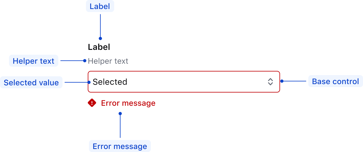
| Elements | Usage |
|---|---|
| Label | Required |
| Helper text | Optional |
| Selected value | Options: empty (default), isSelected |
| Base control | Requried |
| Error message | Triggered by system |
State
Default
Default

Hover

Focus

Disabled
- Disabled fields are not editable by the user.
- If the user doesn’t need to review the data, consider using a hidden field instead.
- Use these fields sparingly.
Default

Hover

Focus

Invalid
Default

Hover

Focus

Conformance
Form::Select is conformant when used as directed.
Accessibility Considerations
Mouse
Hover

Click to open OptionList
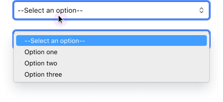
Hover between items
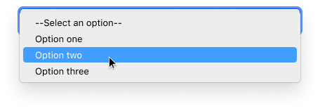
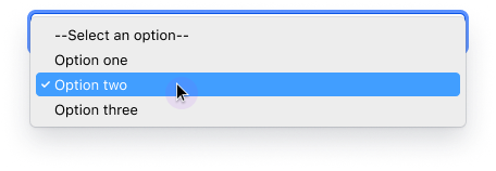
Click to select OptionList/Item
Keyboard
Focus

Open OptionList
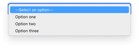
Move between items
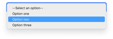
Select OptionList/Item
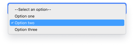
Close with changing

Applicable WCAG Success Criteria (Reference)
This section is for reference only, some descriptions have been truncated for brevity. The Form::Select::Base variation of this component is conditionally conformant; that is, it is not conformant until it has an accessible name. Otherwise, this component intends to conform to the following WCAG Success Criteria:
-
1.3.1
Info and Relationships (Level A):
Information, structure, and relationships conveyed through presentation can be programmatically determined or are available in text. -
1.3.2
Meaningful Sequence (Level A):
When the sequence in which content is presented affects its meaning, a correct reading sequence can be programmatically determined. -
1.3.4
Orientation (Level AA):
Content does not restrict its view and operation to a single display orientation, such as portrait or landscape. -
1.3.5
Identify Input Purpose (Level AA):
The purpose of each input field collecting information about the user can be programmatically determined when the input field serves a purpose identified in the Input Purposes for User Interface Components section; and the content is implemented using technologies with support for identifying the expected meaning for form input data. -
1.4.1
Use of Color (Level A):
Color is not used as the only visual means of conveying information, indicating an action, prompting a response, or distinguishing a visual element. -
1.4.10
Reflow (Level AA):
Content can be presented without loss of information or functionality, and without requiring scrolling in two dimensions. -
1.4.11
Non-text Contrast (Level AA):
The visual presentation of the following have a contrast ratio of at least 3:1 against adjacent color(s): user interface components; graphical objects. -
1.4.12
Text Spacing (Level AA):
No loss of content or functionality occurs by setting all of the following and by changing no other style property: line height set to 1.5; spacing following paragraphs set to at least 2x the font size; letter-spacing set at least 0.12x of the font size, word spacing set to at least 0.16 times the font size. -
1.4.3
Minimum Contrast (Level AA):
The visual presentation of text and images of text has a contrast ratio of at least 4.5:1 -
1.4.4
Resize Text (Level AA):
Except for captions and images of text, text can be resized without assistive technology up to 200 percent without loss of content or functionality. -
2.4.6
Headings and Labels (Level AA):
Headings and labels describe topic or purpose. -
2.4.7
Focus Visible (Level AA):
Any keyboard operable user interface has a mode of operation where the keyboard focus indicator is visible. -
3.2.1
On Focus (Level A):
When any user interface component receives focus, it does not initiate a change of context. -
3.2.2
On Input (Level A):
Changing the setting of any user interface component does not automatically cause a change of context unless the user has been advised of the behavior before using the component. -
3.2.4
Consistent Identification (Level AA):
Components that have the same functionality within a set of Web pages are identified consistently. -
3.3.2
Labels or Instructions (Level A):
Labels or instructions are provided when content requires user input. -
4.1.1
Parsing (Level A):
In content implemented using markup languages, elements have complete start and end tags, elements are nested according to their specifications, elements do not contain duplicate attributes, and any IDs are unique. -
4.1.2
Name, Role, Value (Level A):
For all user interface components, the name and role can be programmatically determined; states, properties, and values that can be set by the user can be programmatically set; and notification of changes to these items is available to user agents, including assistive technologies.
Support
If any accessibility issues have been found within this component, let us know by submitting an issue.