The Table component should be used for displaying tabular data; it renders an HTML table element.
Usage
When to use
- To display and organize tabular data.
- When comparing, sorting, and filtering multi-dimensional data and objects.
When not to use
- As a layout mechanism.
- As a replacement for a spreadsheet or similar application.
Columns
Sorting

- Sorting is not relevant for all content, so consider when to apply sorting thoughtfully.
- Columns that do contain a sortable data type are interactive and therefore have corresponding hover, active, and focus states.
- A Table may only be sorted by a single value at a time.
Width
Column width is determined by manually resizing the header column and cells within Figma. As a best practice, column width should be adjusted to fit the longest data type within the cell.
Alignment
Use consistent alignment throughout the Table. We recommend using end-alignment in the last column when displaying non-text based content.


Placement
Column placement determines the visual styling based on where the column is placed relative to other columns in the Table.

Rows
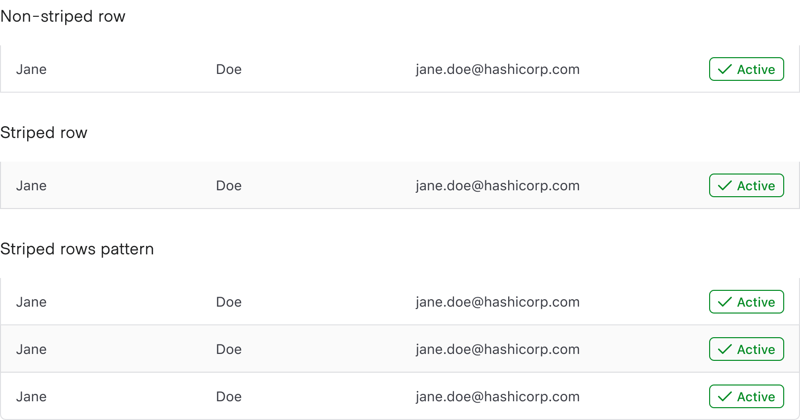
Striping

While striping is not required, we recommend it for the added usability benefits.
When using striping in a Table, start with the second row to allow the Table Header to be further differentiated from the the row directly beneath it.
Benefits of striping
- Striping makes data within the Table easier to read by increasing differentiation between rows.
- Striping increases scannability, especially for large datasets that result in many rows.
- Striping increases legibility when the type of data is similar between columns; e.g., columns that catalog mostly text or numerical data benefit from more differentiation between rows.
Placement
Row placement determines the visual styling based on where the row is placed relative to other rows within the Table. Only cells with a column placement that is either start or end utilize the row placement property; column position middle does not utilize this property.

Headers
Content
- Headers should be clear, concise, and straightforward.
- The headers should infer clearly what type (string, number, status, etc) of content is contained within the cell.
- Headers should use sentence-case capitalization, not all-caps.
Cells
Density

- We recommend using
mediumcell density by default. - If content is complex or a smaller data set (e.g., a Table of basic user data),
tallcell density allows for more breathing room surrounding the content. - If content is largely string/text-based,
shortallows for more content to be displayed within the page. - While denser content allows for more rows to be displayed within a single page, it also makes comprehension more difficult and can reduce scannability.
Content
While we are not prescriptive about what goes into a cell, there are some best practices to consider:
- We recommended keeping data within a column to one data type. Using more than one data type makes sorting almost impossible.
- While it‘s possible to change the text style/color within a cell, we recommended only using Helios font styles.
Icon usage
Icons nested within cells can help differentiate content, see status, and increase the hierarchy of a piece of data or object. Use the outlined icon style by default and if contrast against other icons is important, use the filled style.
Icons should rarely be used without a text label. A label helps reinforce the purpose and communication of the icon and can reduce ambiguity when expressing complex data.
![]()
Leading vs. trailing icons
Both leading and trailing icons increase the visual weight of the content within the cell, so use icons intentionally throughout Tables. Take care not to mix and match different icon positions in the same column.
In general, we recommend using leading icons because the text following the icon will remain aligned and thus be easier for the user to scan.
![]()
![]()
This component takes advantage of the sort-by helper provided in ember-composable-helpers. While some of the examples provided on our documentation use some of the other helpers provided in this addon, they are not required to use Helios. Read the configuration information provided by the addon if you wish to customize which helpers are included in your own app.
How to use this component
Static Table (non-sortable)
If you don’t have or want to use a model, a basic invocation could look like:
<!-- app/templates/components/table.hbs -->
<Hds::Table>
<:head as |H|>
<H.Tr>
<H.Th>Artist</H.Th>
<H.Th>Album</H.Th>
<H.Th>Release Year</H.Th>
</H.Tr>
</:head>
<:body as |B|>
<B.Tr>
<B.Td>Custom Cell Content</B.Td>
<B.Td></B.Td>
<B.Td>Some other custom cell content</B.Td>
</B.Tr>
</:body>
</Hds::Table>
Simple Table with model defined (non-sortable)
To use a table with a model, define the data model and insert your own content into the :head and :body blocks.
<!-- app/templates/components/table.hbs -->
<Hds::Table @model=>
<:head as |H|>
<H.Tr>
<H.Th>Artist</H.Th>
<H.Th>Album</H.Th>
<H.Th>Release Year</H.Th>
</H.Tr>
</:head>
<:body as |B|>
<B.Tr>
<B.Td></B.Td>
<B.Td></B.Td>
<B.Td></B.Td>
</B.Tr>
</:body>
</Hds::Table>
For documentation purposes, we‘ve imitated fetching data from an API and are working with that as our data model.
import Route from '@ember/routing/route';

export default class ComponentsTableRoute extends Route {
  async model() {
    let response = await fetch('/api/folk.json');
    let { data } = await response.json();

    return data.map((model) => {
      let { attributes } = model;
      return { ...attributes };
    });
  }
}
Sortable Table
For the sortable table, the invocation and use is a little bit different:
Shape the data model for use; we’ve placed it in the page‘s route.
In this example, we’re identifying the column headers (keys) and also capitalizing them.
Each column object has two pieces:
- a
key-- used for the model, thesortingKeys, andsortBy - a
label-- used in the table header cells
- a
// app/routes/components/table.js

import Route from '@ember/routing/route';
import { capitalize } from '@ember/string';

export default class ComponentsTableRoute extends Route {
  async model() {
    let response = await fetch('/api/folk.json');
    let { data } = await response.json();

    // make sure the variable is declared outside of the loop
    // so we can return it in the model response
    let columns;
    let dataResponse = data.map((model) => {
      let { id, attributes } = model;
      columns = Object.keys(attributes);
      return { id, ...attributes };
    });
    columns = columns.map((column) => {
      return { key: column, label: capitalize(column) };
    });
    return { data: dataResponse, columns };
  }
}
- Invoke
Hds::Tablein your template file.
<!-- app/templates/components/table.hbs -->
<Hds::Table
@model=
@columns=
>
<:body as |B|>
<B.Tr>
<B.Td></B.Td>
<B.Td></B.Td>
<B.Td></B.Td>
</B.Tr>
</:body>
</Hds::Table>
Indicate which columns are sortable
If you want, you can indicate that only specific columns should be sortable.
<!-- app/templates/components/table.hbs -->
<Hds::Table
@model=
@columns=
@sortingKeys=
>
<:body as |B|>
<B.Tr>
<B.Td></B.Td>
<B.Td></B.Td>
<B.Td></B.Td>
</B.Tr>
</:body>
</Hds::Table>
Pre-sorting columns
You can also indicate that a specific column should be pre-sorted.
<!-- app/templates/components/table.hbs -->
<Hds::Table
@model=
@columns=
@sortingKeys=
@sortBy='artist'
>
<:body as |B|>
<B.Tr>
<B.Td></B.Td>
<B.Td></B.Td>
<B.Td></B.Td>
</B.Tr>
</:body>
</Hds::Table>
Pre-sorting direction
You can also indicate that a specific column should be pre-sorted in a specific direction.
<!-- app/templates/components/table.hbs -->
<Hds::Table
@model=
@columns=
@sortingKeys=
@sortBy='artist'
@sortOrder='desc'
>
<:body as |B|>
<B.Tr>
<B.Td></B.Td>
<B.Td></B.Td>
<B.Td></B.Td>
</B.Tr>
</:body>
</Hds::Table>
Complex sortable Table
Here’s a table implementation that uses an array hash with localized strings for the column headers, indicates which columns should be sortable, and adds an overflow menu.
<!-- app/templates/components/table.hbs -->
<Hds::Table
@model=
@columns=
@sortingKeys=
>
<:body as |B|>
<B.Tr>
<B.Td></B.Td>
<B.Td></B.Td>
<B.Td></B.Td>
<B.Td>
<Hds::Dropdown as |dd|>
<dd.ToggleIcon
@icon='more-horizontal'
@text='Overflow Options'
@hasChevron=
@size='small'
/>
<dd.Interactive @route='components.table' @text='Create' />
<dd.Interactive @route='components.table' @text='Read' />
<dd.Interactive @route='components.table' @text='Update' />
<dd.Separator />
<dd.Interactive
@route='components.table'
@text='Delete'
@color='critical'
@icon='trash'
/>
</Hds::Dropdown>
</B.Td>
</B.Tr>
</:body>
</Hds::Table>
Component API
The Table component itself is where most of the options will be applied. However, the child components can also be used if a custom implementation is needed.
- The
Hds::Table::Trcomponent is a template-only component. It supports use of...attributesbut is not eligible to receive interactions (e.g., it cannot have anonClickevent handler attached directly to it). It can containHds::Table::ThorHds::Table::Tdcomponents. - The
Hds::Table::Thcomponent is a template-only component. It supports use of...attributesand can contain interactive elements but is not eligible to receive interactions itself. It‘s unlikely you‘ll need to add interactive elements, as sorting is already provided. - The
Hds::Table::Tdcomponent is a template-only component. It supports use of...attributesand can contain interactive elements (e.g.,<td><a href="user-info.html">User info</a></td>) but is not eligible to receive interactions itself (e.g., it cannot have anonClickevent handler attached directly to it).
- Name
-
<:head> - Type
-
named block - Description
-
This is a named block where the content for the table head (
<thead>) is rendered.
- Name
-
<:body> - Type
-
named block - Description
-
This is a named block where the content for the table body (
<tbody>) is rendered.
- Name
-
model - Type
-
array - Description
-
If defined, sets the data source that gets yielded by the
:bodynamed block.
- Name
-
columns - Type
-
array - Description
-
Use an
arrayhash to define your table columns. Whilekeyandlabelare required, other options includeisSortable,align(for text-alignment), andwidth.
- Name
-
sortBy - Type
-
string - Description
- If defined, indicates which column should be pre-sorted when the table is rendered.
- Name
-
sortOrder - Type
-
string - Values
-
- asc (default)
- desc
- Description
-
Use in conjunction with
sortBy. If defined, indicates which direction the column should be pre-sorted in. If not defined,ascis applied by default.
- Name
-
onSort - Type
-
function - Description
-
Callback function invoked (if provided) when one of the sortable table headers is clicked, and a sorting is triggered. The function receives the values of
sortByandsortOrderas arguments.
- Name
-
isStriped - Type
-
boolean - Values
-
- false (default)
- true
- Description
-
Define on the table invocation. If set to
true, row striping ("zebra striping") will be applied to the table.
- Name
-
isFixed - Type
-
boolean - Values
-
- false (default)
- true
- Description
-
If set to
true, thetable-display(CSS) property will be set tofixed, which will automatically distribute columns equally based on the total width of the table.
- Name
-
density - Type
-
enum - Values
-
- short
- medium (default)
- tall
- Description
- If set, determines the density, or height, of the table’s rows.
- Name
-
valign - Type
-
enum - Values
-
- top (default)
- middle
- Description
-
If set, determines the vertical alignment for all cell (
td) content in a table. Does not apply to table headers (th).
- Name
-
caption - Type
-
string - Description
- Adds a (non-visible) caption for users with assistive technology. If set on a sortable table, the provided table caption is paired with the automatically generated sorted message text.
- Name
-
…attributes - Description
-
Supported for the
Hds::Tablecomponent.
Anatomy
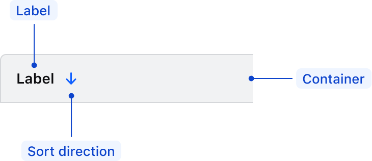
Table headers

| Element | Usage |
|---|---|
| Label | Required |
| Sort direction | Options: none, ascending, descending |
| Container | Required |
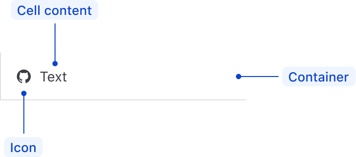
Table cells

| Element | Usage |
|---|---|
| Cell content | Required |
| Icon | Optional |
| Container | Required |
States
Header columns
Only sortable header columns have state variants. Non-sortable header columns are not interactive and therefore do not have interactive states.

Conformance rating
When used as recommended, there should not be any WCAG conformance issues with this component.
Focus in Tables
- Focus will only move through sortable headers and will skip over non-sortable headers as they aren‘t interactive.
- Interactive elements within cells will receive focus, but entire cells and entire rows will not.


Best practices
Tooltips in headers
Since columns within the table header can control sorting within the table, the header column is not eligible to receive additional interactive elements such as tooltip/toggletip or other components that rely on interactivity to display content (nested interactive elements).
If you need a tooltip, there may not be enough contextual information about the table or the label within the header may not be clear enough.

Interactive rows
The table row element (tr) is not eligible to receive interactions. That is, actions cannot be attached to a table row. If an interactive element is desired, place it within a table cell element (td) within that row (i.e., <td><a href="somelink.html">Some link</a></td>).
For engineers
When providing additional or alternative styles to the table element, do not change the display property in the CSS. This alters how the table is presented to the user with assistive technology; they will no longer be presented with a table.
Applicable WCAG Success Criteria
This section is for reference only. This component intends to conform to the following WCAG Success Criteria:
-
1.3.1
Info and Relationships (Level A):
Information, structure, and relationships conveyed through presentation can be programmatically determined or are available in text. -
1.3.2
Meaningful Sequence (Level A):
When the sequence in which content is presented affects its meaning, a correct reading sequence can be programmatically determined. -
1.4.1
Use of Color (Level A):
Color is not used as the only visual means of conveying information, indicating an action, prompting a response, or distinguishing a visual element. -
1.4.10
Reflow (Level AA):
Content can be presented without loss of information or functionality, and without requiring scrolling in two dimensions. -
1.4.11
Non-text Contrast (Level AA):
The visual presentation of the following have a contrast ratio of at least 3:1 against adjacent color(s): user interface components; graphical objects. -
1.4.12
Text Spacing (Level AA):
No loss of content or functionality occurs by setting all of the following and by changing no other style property: line height set to 1.5; spacing following paragraphs set to at least 2x the font size; letter-spacing set at least 0.12x of the font size, word spacing set to at least 0.16 times the font size. -
1.4.13
Content on Hover or Focus (Level AA):
Where receiving and then removing pointer hover or keyboard focus triggers additional content to become visible and then hidden, the following are true: dismissible, hoverable, persistent (see link). -
1.4.3
Minimum Contrast (Level AA):
The visual presentation of text and images of text has a contrast ratio of at least 4.5:1 -
1.4.4
Resize Text (Level AA):
Except for captions and images of text, text can be resized without assistive technology up to 200 percent without loss of content or functionality. -
2.1.1
Keyboard (Level A):
All functionality of the content is operable through a keyboard interface. -
2.1.2
No Keyboard Trap (Level A):
If keyboard focus can be moved to a component of the page using a keyboard interface, then focus can be moved away from that component using only a keyboard interface. -
2.1.4
Character Key Shortcuts (Level A):
If a keyboard shortcut is implemented in content using only letter (including upper- and lower-case letters), punctuation, number, or symbol characters, then it should be able to be turned off, remapped, or active only on focus. -
2.4.3
Focus Order (Level A):
If a Web page can be navigated sequentially and the navigation sequences affect meaning or operation, focusable components receive focus in an order that preserves meaning and operability. -
2.4.7
Focus Visible (Level AA):
Any keyboard operable user interface has a mode of operation where the keyboard focus indicator is visible. -
4.1.1
Parsing (Level A):
In content implemented using markup languages, elements have complete start and end tags, elements are nested according to their specifications, elements do not contain duplicate attributes, and any IDs are unique. -
4.1.2
Name, Role, Value (Level A):
For all user interface components, the name and role can be programmatically determined; states, properties, and values that can be set by the user can be programmatically set; and notification of changes to these items is available to user agents, including assistive technologies.
Support
If any accessibility issues have been found within this component, let us know by submitting an issue.